The Business
Founded as Gulf and Fraser Fishermen’s Credit Union in 1940, G&F Financial Group developed over the next 80 years as a major credit union centered in British Columbia’s Lower Mainland. As a full-service credit union, they offer everything from basic checking and savings accounts to home mortgages and loans to life insurance plans. G&F has 16 branches, including locations in Vancouver, Burnaby, New Westminster, and Port Coquitlam.
The Problem
In addition to the Coquitlam and Fleetwood offices, the Denman St. branch of G&F in Vancouver’s West End needed an overhaul. The floorplan and layout of the office were outdated and weren’t in keeping with G&F’s most up-to-date branding guidelines and visual identification. The branch also had too many blind spots and partitioned areas that kept staff from being able to efficiently and clearly get an overview of the whole space to better assist customers and communicate between departments. There was a marked need and interest in putting together the sort of inviting, welcoming environment that would both draw in new customers and make current customers feel as though G&F was a modern and thriving business, as well as making it simple and stress-free to navigate through the branch office.
The Solution
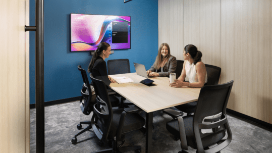
Branding was met successfully with colourful and easily-readable yet unobtrusive and naturalistic graphics, highlighted in subtle usage of G&F’s blue-and-orange colour scheme. The Denman location was given an open-feeling and easily navigable layout consistent with other branches, including glass-walled rooms and other high-visibility enhancements, so as to quickly and easily accommodate customers and employees who were visiting or had transferred from other locations. And the technological aspects of the business were made more accessible for employees throughout the office, so a number of tech-based solutions to workflow matters would be available in a flexible way.
The Outcome
Not only did the new space adhere to G&F’s corporate brand, but it also did so in a lively and attractive way. The reworked layout encouraged employees to work in a versatile manner, using nontraditional working methods to improve both the efficiency and the ease of their work. And the updated layout ensured that all the issues that had caused concern, from client visibility to ease of navigation to security matters, were addressed and improved upon noticeably. As a result, employee feedback was highly positive about the new space, and staff found themselves excited and energized by the changes.
Learn what else Aura can do for you and your office space! Feel free to contact us, and see what other spaces we’ve brought to life.


